What would a floating sheep map?
Authorship: Matthew Zook (Department of Geography, University of Kentucky), Taylor Shelton (Center for Urban Innovation, Georgia Institute of Technology), Ate Poorthuis (Singapore University of Technology and Design), Rich Donohue (Department of Geography, University of Kentucky), Matthew Wilson (Department of Geography, University of Kentucky), Mark Graham (Oxford Internet Institute, University of Oxford), Monica Stephens (University at Buffalo, SUNY).
Zook M, T Shelton, A Poorthuis, R Donohue, M Wilson, M Graham, M Stephens.
Preferred citation format: Zook M, T Shelton, A Poorthuis, R Donohue, M Wilson, M Graham, M Stephens. What would a floating sheep map? Lexington, KY: Oves Natantes Press, 2015. http://manifesto.floatingsheep.org.
We are the map, we are the mapped, we are the mapping. We are the unmap, we are the unmapped, we are the unmapping.
This is an essay about maps. But it is not just about maps.
Don't get us wrong. We like maps and celebrate high-quality, aesthetically-pleasing, intellectually engaging and (yes) amusing maps. Our aim, however, is to do much more than express an appreciation for maps. We also want to challenge people to think deeply about space, construct maps that demonstrate an awareness of social contexts, and critique these very same maps. Thus, this essay focuses not on the specific techniques or technologies of map-makingAlthough if you are interested in that kind of stuff you should definitely check out this amazingly cool, cutting-edge, online mapping program called New Maps Plus. Sorry for the shameless plug, feel free to ignore., but on the societies, spaces, and places that are being mapped, and from which maps emerge.
Creating Floating Sheep Space
This essay itself is the product of a particular set of social and spatial relations. The authors are based in three continents. Sections were written in places as diverse as Barcelona in Spain, Manila in the Philippines, Tartu in Estonia, Nairobi in Kenya, Singapore in SingaporeOK, Singapore of Singapore is redundant but we didn't want to lose the flow. , Oxford in England, and Atlanta, Buffalo and Lexington in the United States. Despite the diverse geography of its creation, all of the authors have some connection with the University of Kentucky's Department of Geography, an institution with a strong tradition in the development of geographical thinking around information and communication technologies and critical approaches to mapping. While we were not all co-present in the same spaces at the same times, the collaboration between us would not exist without such a connection. In spite of the multiple space-time trajectories, many parts of this essay were conceived and argued over on the back porch of a house on South Upper Street, in Lexington, Kentucky, a particular kind of micro-geography conducive to the development of the text. All of that is to say that this essay is the outcome not only of the individuals who wrote it, but also of the places that we have inhabited throughout the process.
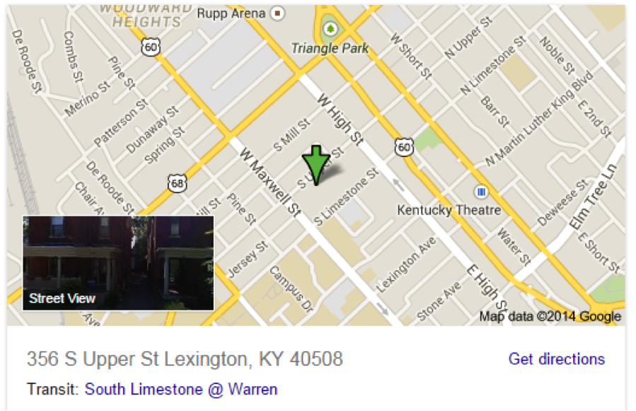
Figure 01. Google Map of 356 S. Upper Street Lexington, KY. Source: Google Maps
This work also emerges from a project involving many of us over the past six years: what we've called the Floating Sheep Collective.Like many complex social phenomenon, the question of "Why Floating Sheep?" does not yield a single simple answer. Well, actually, there sort of is, but we'd prefer to obscure this reason behind an elaborate smokescreen of misdirection. See Why FloatingSheep? if this really bothers you, or simply forget about this and get on with reading the essay. On theFloatingSheep blog, we have shared a number maps of highlighting the geographies of Twitter, Wikipedia, Google Maps, and Flickr, among other online services. Our aim is to demonstrate the always-existing intersections between our digital and material lives and spaces. But this work was never only just about the maps, or online data. Rather, it was about how maps can help us gain alternative perspectives on the world.
One of the guiding principles used by the collective has been to perform our analysis with a certain kind of irreverence.Most observable in this essay via the snide commentary in the footnotes. And the choice of some of the examples. And perhaps the breeziness of the writing style. OK, it is peppered all the way through this thing. No sacred cow has been spared in the analysis,It is important for readers to understand that we only spare sheep. Not cows. Never cows. For that matter, we're not particularly crazy about chickens either. as we have attempted to understand how any number of social practices, as reflected in digital content, remain intimately tied to, and shaped by, particular places. Floating Sheep often puts these phenomena into unexpected, and often nonsensical, comparisons, rendering maps such as the Beer Belly of America, which compared the prevalence of bars and grocery stores across the United States. Other classic oppositions have seen church and beer pitted against one another, and Chuck Norris and hobbits.Sadly although hobbits contributed to the downfall of Sauron, the Dark Lord of Mordor, they didn't stand much of a chance against Chuck Norris.
Like we said, many of these comparisons are nonsensical.Apart from the one about hobbits, of course. And while the underlying geographic patterns don't often make much sense, the fact that there are underlying geographic patterns at all is interesting. But the maps never speak for themselves.How could they? Most are completely lacking in any vocal cords. Another hallmark of the Floating Sheep approach has been our attempts to explicitly interrogate the maps that we (and others) produce, and attempt to uncover the logic that generated the maps as such. We can ask about what is missing from the map that we expected to see, and why that might be the case. For instance, why are there relatively more tweets referencing zombies in Germany than in France? Is it simply language differences? Or is there a German cultural meme that is conducive to zombies? Or is it population differences such as the presence of US military personnel in Germany who are doing all the zombie tweets? Or perhaps there are simply more zombies in Germany? (Graham, Shelton, and Zook. 2013).
While we have occasionally uncovered some very interesting findings with this work, we have also used this work as something of a meta-critique of the current fad of searching for endless, and often spurious, correlations through the analysis of so-called 'big data'. Indeed, in some ways Floating Sheep can be thought of as "big data satire" or at least a "big data cautionary tale." Along the same lines, as Tyler Vigen's popular website highlights, all kinds of things in the world are correlated—such as the marriage rate in Kentucky and per capita consumption of whole milk in the US from the year 2000 through 2009.We are not entirely clear the source of this whole milk; sadly it is most likely not from sheep but cows. We will never understand society's love affair with the cow. This alone does not mean that there is any connection between the given variables, much less a causative connection. Our work follows a similar line of reasoning, albeit with a much more explicitly geographic component to the correlations and patterns we've sought to uncover.
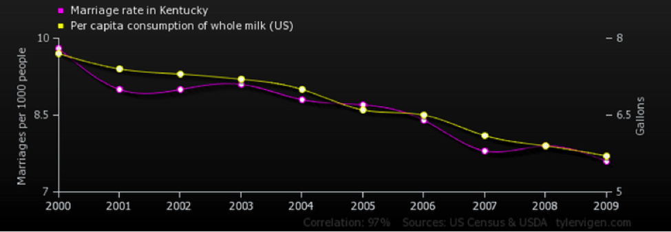
Figure 02. Source: http://www.tylervigen.com/spurious-correlations.
The Internet–and information, more broadly–is always shaped by geography, and in turn shapes geographies. Rather than representing the 'end of geography', the Internet has made geography more important and visible in our everyday lives. As the web became increasingly user-generated, it also became more explicitly tied to geography through practices of "geotagging" (attaching latitude and longitude coordinates to pieces of content). Likewise, the era of "open data", "big data" and "open source mapping" has made previously inaccessible spatial datasets (or perhaps only accessible to those within certain, largely governmental, institutions) more widely available, allowing a range of people to come to grips with the geographies (aka map) any number of phenomena. This explosion of new forms and availabilities of geographically-referenced information provides fertile ground for analyzing key questions about the world around us, including the persistent and fundamental connections between the digital and the material.
How Did We (and Maps) Get Here?
In one sense, a map is a map. But clearly not all maps are the same. While some tend to think of maps as neutral, scientific and apolitical representations of the world, this is largely a historically contingent result of the post-WWII era. Some of the oldest maps demonstrate different priorities in representing spaces and locations. These maps weren't concerned with physically accurate depictions of a world encoded with latitude and longitude coordinates, and thus may not be called "maps" by many peoples' standards today. For example, maps that placed Jerusalem at the center of the map implicitly made Jerusalem the center of the entire world. Such maps were driven by a desire to depict cultural or spiritual values, rather than to accurately account for the relation between different locations and landforms in absolute space.
Though these logics have changed over time, there is always a prioritization of particular values that shape the ways we make maps and think about the world. This is no less true of our contemporary shift towards more technologically sophisticated, web-based mapping tools rather than maps that are hand drawn on papyrus or vellum.
For instance, many web maps utilize the Web Mercator projection, largely due to a path-dependency in mapping technologies resultant from the pioneering use of "slippy" map tiles by Google Maps in 2005. Of course the Mercator projection greatly distorts the relative size of continents, making Greenland appear to be the same size as Africa. Such decisions and priorities entangle web maps within a longer history of imperialist, Euro-centric visions of the world.
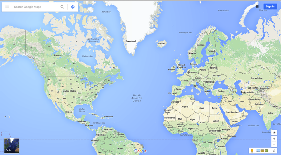
Figure 03. Source: Google Maps
So why, if the Mercator projection is the "tool of imperialists", does Google Maps (as well as other web mappers) continue to utilize it? Are we to assume that all web mappers want to subjugate foreign people and claim their territories? Probably not.Though, of course, the US Department of Defense’s financial investments in various web mapping companies doesn’t particularly bode well in this respect. But at least they’ve declared Web Mercator unfit for official use, see: NGA Advisory Notice on "Web Mercator" A key advantage of Web Mercator is that it preserves compass orientation and angles at different scales so map tiles can easily be constructed in a consistent way. It also provides a consistent way of structuring datasets so they can load and be displayed quickly and easily. For many, Web Mercator is convenient simply because there are a number of free mapping platforms that utilize the projection.
In other words, these web mappers are prioritizing certain things–availability, price, ninety degree angles in street grids–over other things, such as relative size of land masses. This isn't wrong, per se, but it's important to remember that the setting of priorities in the mapping process can have significant, if unexpected, repercussions.
Point One, Mapping is about Setting Priorities
Many prioritizations happen without our direct input or conscious thought. For example, when you look at a map on your phone, it is all about you. You are here, a blinking little blue dot of priority.Although actually it is not just about you. Local sites of note (Good Samaritan Hospital and Memorial Coliseum) as well as a Pizza Hut, a Papa John’s and a Chick-fil-A also emerge as priorities. Which says something profound about one’s expected role in modern American life.
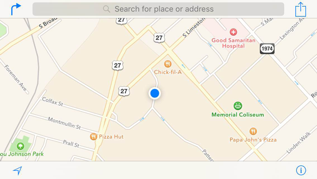
Figure 04. Source: a phone
And, like standing at the center of a trampoline (aka the sum of your embedded social arrangements and technologies), these maps organize the world around you. Objects that surround your weighty center appear closer, oriented towards you; plunging at times towards you. Things farther away are less relevant and often distorted into misleading and even dangerous-seeming representations.For example, the edges of your trampoline might appear to be full of rusty, metal springs waiting to catch you unawares. Ok, this analogy has now officially jumped the shark. Maps orient; although, popular convention would hold that they navigate. Potato, potahto. Orient, navigate. However, the phenomenon of maps orienting the world around a priority is hardly new. Indeed, the priorities embodied by some of the oldest maps provide a useful point of reference.
Jumping back to the time-space of medieval Geography, we encounter Mappa Mundi–the term given to any Medieval European map of the world. These representations are now viewed as hopelessly spiritualized. They lack the technical and methodological rigor of the detached, objective perspective associated with mapping in the 20th century (Lozovsky 2011). We contend, however, that rather than simply being insufficiently "true," representations like the Hereford Mappa Mundi (ca. 1285) prioritize a relational representation of space based in spirituality, rather than a more conventional Cartesian conceptualization. In this depiction–as well as many others like the Bünting Clover Leaf–the world is oriented around Jerusalem at the center.
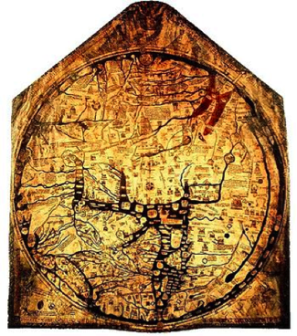
Figure 05.a. Hereford Mappa Mundi.
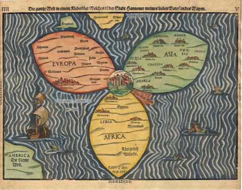
Figure 05.b. Bünting Clover Leaf.
Thus, placing features on the map is not simply about physical proximity, but a process of ordering the world in terms of what "matters." All locations—ranging from historical cities to future trajectories such as "Paradise"—are oriented in relation to Jerusalem, the spiritual capital of Christianity. In Mappi Mundi, the mantra of "you are here" is to facilitate our navigation through our immediate surroundings, but also a political, economic, cultural, social and doctrinal process of placing the user. Where we are and where we want to be are not simply left to our own fancies, but are embedded in the larger social processes of Christianity. And of course this has repercussions.Such as being so taken by the priorities of your worldview/map, that you set out to conquer Jerusalem. See, the Crusades.
These medieval maps highlight a sensibility quite common in mapping: the things that matter occupy the center position with the world organized relative to it.Like, you know, the Holy Land. Or more recently, your phone. In these medieval maps, Jerusalem is at the center, in both representation and in thought. Thus, the trope of Jerusalem reminds us that maps set priorities, and those priorities reflect broader conventions. While the Copernican system dispelled the then-dominant priorities of Christianity in maps, these processes of prioritizing particular places and ways of thinking about those places are not outdated relics. Indeed, decisions about priorities continue to motivate and shape our contemporary mapping practices, orient us and help us to navigate our world (both literally and figuratively).
We are the New Jerusalems
The recent technological innovations in web mapping have reconfigured both the discourses and practices associated with contemporary mapping. Collectively, this process is known by different terms by academic geographers who have focused on things like "volunteered geographic information" (Goodchild, 2007) or the "geoweb", while those outside of the Ivory Tower have called it "neogeography" (Turner, 2006). Regardless of the nameWhat's in a name? What we call VGI/Geoweb/NeoGeography, by any other name would represent so sweet. Our apologies to Shakespeare., these changes have been rapid, emerging in the last five to ten years. Indeed, the origin story that is often told is traced back to the public release of Google Earth in 2005, a moment in which the creation of maps became significantly easier for non-experts. Users could create their own data by dropping placemarks and adding text or photographs, creating a geographically-referenced record of their vacation photos or the place that they had their first kiss, or of the sites of recent housing evictions.
Thus, the notion of the "the map" as static, generalized, and created by trained experts has transformed into an era of "maps": dynamic, highly specific, created by amateurs and allowing for a diversity of perspectives to be represented simultaneously. There is no longer a single "truth" embodied in "the map" (such as Jerusalem is the center of the world), but socially and culturally-specific "truths" embedded in "maps". As part of this broader shift in digital cultural practices, early online mapping was geared less towards thinking about representations of the world and more about the ethos of sharing one's own place(s) through the creation of placemarks, geotagging Flickr photos, etc.
In short, we are the new Jerusalems! Which is incredible and also fairly egotistical; but that's people.Especially academics. Professorial egos are the worst. Trust us, we know..
We also have to remember it is not simply us making and orienting these maps. Through highly complex software algorithms embedded in our phones and applications like Google Maps that are installed on them, we no longer have to place ourselves at the center of our own map. Instead, these lines of software code come together to locate us in relation to our immediate (and more distant) surroundings. We can instantaneously pull up our own location, directions to other locations, or search for specific things, like places to go out to eat. In short, the maps are also making themselves, and in the process are remaking us.
It's not that we no longer place Jerusalem at the center of maps. We are. It's just that the nature of Jerusalem isn't what we thought it was. Putting Jerusalem at the center of the map was never about Jerusalem as a place, but about a way of situating the world and our relation to it, demonstrating our priorities in cartographic form. Jerusalem is still being placed (manually and by algorithms) at the center of our maps; it's just that each of us has become our own New Jerusalem(s).At least in terms of mapping; very few people become their own new Jerusalem in terms of religious significance, and those who do, tend to be of the "let's all wear our underpants on our heads: Thus spake ME" type.
Point Two, Revisiting Some Key Figures in Mapping
Arthur Robinson (1952) developed the guiding principles of late-20th century scientific cartography. His idea of what we generally refer to as the "cartographic communication" model have enormously influenced the modern practice of map making. Robinson maintained that discrete messages for intended map audiences can be controlled, counted, and counted upon. The thematic map is a language that can be rationalized and fine-tuned for a new kind of map user: homomapicus. Cartographers no longer practice art, but wield Science.Robinson "blinded cartography with science", apologies to Thomas Dolby. Maps are graphic representations of the milieu, vehicles for sending specific messages to particular users. There would be no politics, emotion, ideology or bias in scientific cartography; only well-crafted, visually balanced, and variable-controlled representations of geographic phenomena.
While Robinson's agenda for scientific cartography remained dominant within the academy for much of the mid-20th century—and indeed within broader understandings of cartography—it was periodically challenged by an emergent critical mapping agenda that questioned the priorities and presumptions of scientific cartography. This more critical approach to mapping is perhaps most commonly associated with the work of J.B. (or Brian) Harley, and his seminal paper "Deconstructing the Map", published in the journal Cartographica in 1989. Harley's paper was a rebuke of the way cartographers thought about maps and mapping, asserting that "cartography is seldom what cartographers say it is" (Harley 1989: 1). Rather than understanding maps as a kind of neutral, value-free depiction of the world like Arthur Robinson, Harley saw maps as imbued with meaning and as bearers of power, artifacts that intervene and change the world in service to the powers that be. In this model, maps are seen less as scientific representations of the world and more like texts that represent particular views of the world. These maps as text are instructive less about what actually is, and more about how different individuals and institutions perceive and relate to the world around them.
Though Harley's approach to critical cartography has remained relatively marginal compared to the explosion of interest in geographic information systems in the last twenty-five years, it has come to undergird a significant body of work within and beyond geography. Even as the work of public participation GIS and other subfields institutionalized such critical approaches to mapping, another set of priorities emerged around these technologies. As was mentioned previously, the increasing connection between mapmaking and not only computers, but also the internet, ushered in a shift in cartographic expertise that Harley would have appreciated. What Andrew Turner infamously termed neogeography was a kind of playful, individually-centered, yet collective, way of creating and sharing geographic information that stands in contrast to Robinson's ideas about cartographic expertise. This was, in some small way, not only about the creation of 'new Jerusalems', but about the "democratization of cartography". However, even in this age of web mapping, democracy has its limits; expertise is still very important for making compelling maps (versus more elementary ones) but the skillset is increasingly based in computer programming, rather than in cartography.For example, see the programmatic tools for online mapping – Leaflet, CartoDB, Mapbox, D3, etc. – that have become the tools du jour in the mapping world and represent varying degrees of difficulty to learn.
So, as is hopefully evident, there are a number of tensions driving the development of mapping practices, both historic and contemporary. And, the story is more complex than we've told it here. The critical approach isn't exactly new and predates Harley's 1989 paper. For example, the work of Bill Bunge and Gwendolyn Warren and the Detroit Geographical Expedition and Institute from the late 1960s and early 1970s is one of the best examples of utilizing the knowledge that maps are powerful documents that can be used not only in the service of the State, but also against it, in order to organize communities in an effort to enact social change. Working with academics and community members, the Detroit expedition mapped everything from places where children were run over by cars or bitten by rats, to the potential effects of school redistricting efforts in Detroit.
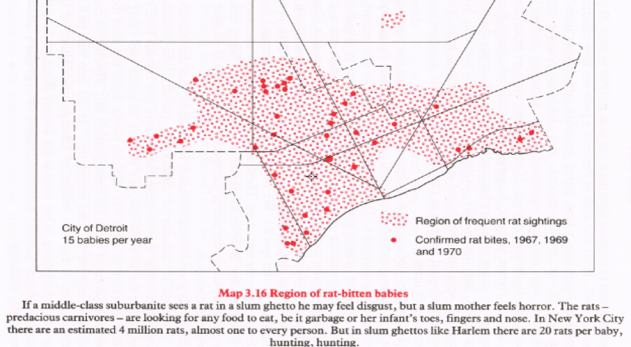
Figure 06. Source: Bunge and Warren (1971).
While Bunge was long-forgotten in the academy due to an unceremonious early exit, the recent rehabilitation of the Detroit Expedition in geography indicates the enduring importance of the efforts and contributions to a critical approach to mapping. Indeed, the Detroit Geographical Expedition and Institute sits at the intersection of these different priorities in a way few would have expected in the 1960s and 70s.
Point Three, Merging Criticality, Cartography and Code
But what do we mean by being critical in mapping? Does it just mean that you sit around and complain? Can one engage in critique without speaking in abstractions? To paraphrase a fellow critical mapper, Jeremy Crampton: to engage in critical mapping is not to establish the truth of geographic representation, but is instead to argue that the truth of representations, such as maps, has a great deal to do with power (Crampton, 2010). In our view this means that critical approaches to cartography and mapping are not about dispensing with the making of maps altogether. Rather, we should seek to identify new ways of mapping that are productive of the kind of world we wish to live in.
In other words, the work of creating maps continues to be about the tensions between different sets of priorities and between different sets of actors involved in the process of making and interpreting a map. In the case of contemporary web mapping, we argue that these competing priorities can be embodied in the tendencies of three figures: the cartographers, the coders and the critics. While these are ideal types (that don't actually exist in the wild), we see current debates in mapping as being defined by the ways these three personas relate to one another and prioritize different aspects of the mapping process. It is the rare individual that is able to achieve the Jedi mind trick of equally balancing all three types. Most of time, it's more like three siblings in the back seat of the car on the long drive back from grandma's through holiday traffic.Or the back porch setting where seemingly endless arguments about this essay took place. Nonetheless, our goal is to be attentive to these tensions, rather than simply ignoring them and existing in a state of (artificial) mapping bliss.
Cartographers
In our era of digital online maps, it is often the cartographers that have felt slighted (c.f. Dodge and Perkins 2008). When one can make a web map in less than ten minutes, why bother learning and implementing any of the various (seemingly fussy) cartographic theories or best-practices that have been developed over the last century (see Bertin, 1983; Krygier and Wood, 2011)? Have we lost the insightful theories behind the ways that classification breaks are supposed to work on quantitative data? Or behind the relative size of proportional symbols? Or behind the different colors used to represent different kinds of phenomena? Why are we ignoring years of cartographic research and making bad maps? The cartographers have invested enormous amounts of scholarly work and maintain that cartography is important. The coders tend to ignore this research. And it has been years since the critics actually made a map. But making good, readable maps is important and unfortunately these days there are so many bad, ugly maps.
Given their focus on making principled decisions in the mapping process and good designAnd speaking of good design, the cartographer persona wants to make sure to point out that the design of this webpage (isn’t it beautiful!) is based on the Tufte CSS created by David Lippman. This (increasingly annoying) persona also wants remind the coder and critic how much uglier (and less effective) this essay would be if the cartographer was not around., cartographers sometimes think that they are the only ones taking maps seriously. But in reality, cartographers (or the caricatured version we are using here) are not taking maps seriously enough. When the focus on producing a "perfect" map prevents people from thinking critically about the ways people are actually engaging with maps, and what the broader social significance of these engagements looks like, there's a problem. And to be fair, this is something that most cartographers are cognizant of.
It's not that we shouldn't want to make maps, or even make pretty maps. Well-designed maps can be beautiful.We strongly recommend the Atlas of Design published by the North American Cartographic Information Society (NACIS). Damn, there are some beautiful maps in there. Also check out Krygier and Wood (2011) Making Maps for some inspiration and really useful "nuts and bolts" kind of suggestions. But we need to be careful with the notion that there is one "best" or "optimal" way of producing said map. There are better and worse ways to do map design, but shouldn't we extend our practice beyond the map? The fundamental reason for making the map is the geographic phenomena itself. A critical concern thereby shifts our focus from whether the map looks good to the way a map represents and reproduces particular understandings of lived phenomena.
A great example of a map that fails spectacularly from a cartographic design perspective but nonetheless is a good map was tweeted by the Canadian delegation to NATO in response to the Russian invasion of Eastern Ukraine in 2014. Despite being an ugly map, it represents powerful marshaling of cartographic power in the best tradition of mapping.
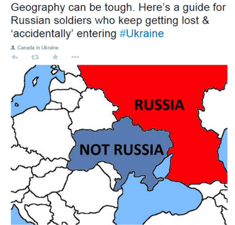
Figure 07. Map Fail (as per Cartographers) but a Useful Map. Source: https://twitter.com/CanadaNATO/status/504651534198927361.
Coders
Unlike cartographers who emphasize long-standing academic knowledge about the production of maps, the coder persona seeks out that which is shiny and new. Coders have little time for catching up on the history of mapping or reflecting on the implications of certain design decisions. The coder persona is so focused on rendering the map using D3.js that they don't reflect on how their map of crime data—and its potential inaccuracies and inherent generalizations—influences how people understand particular places in the city.
The coder persona (as we're pigeon-holing them) also tends to reify the technological innovations that have allowed us to make new and powerful maps. Whether it's the relative ease-of-use of a particular tool, or just a general technological solution as applied to mapping, the coder tendency celebrates the potential of the tools divorced from broader contexts. The coder cannot wait to try out the latest mapping technology and will grab any easily accessible dataset to do so. The result is ugly maps about un-important things Of course, we would never, ever create ugly maps about silly things and post them publicly on FloatingSheep.org. So if you think see a bad map about a meaningless topic on the website, just remember that you are mistaken. Trust us., or perhaps even pretty maps about important things, but which run the risk of obfuscating the bigger issues at hand rather than revealing them. All that matters is that it works, even if that eschews questions of why and how it works, and the ways it does work in the world.
For the coder persona, time spent away from turning data and code into mapping products is painful. The messy and face-to-face processes associated with community and participatory mapping where common priorities, visions and goals are decided in endless hours of meetings before any maps can be made can be excruciating to coders. But the messiness of manufacturing meaning is a key part of mapping.
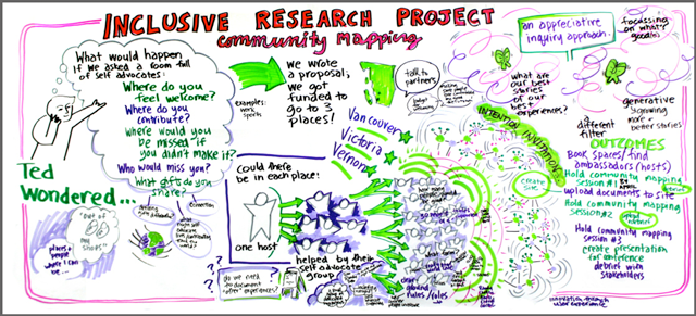
Figure 08. Map Fail (as per Coders) but a Useful Map. Source: http://imagineacircle.com/2013/01/19/community-mapping-project-planning-graphic/.
Critics
And then comes the persona of the critics. They stand in front of lecture halls and pontificate on the power of maps, highlighting not just the fact that maps lie, or that maps are often used in service of unsavory ends, but that maps are expressions that expose our humanity, blah blah blah. We've already stopped listening and we're the ones writing this essay! But seriously, the persona of the map critic is fundamental in that it pushes us to understand the map not just as some techno-scientific artifact that reveals truth to the map reader but a process in which power is put to work in the world. The map critic asks key questions, all the more important because the personas of cartographers and coders are focused on other issues.
Of course, the rub is that the critics (as stereotyped here) often do not bother to actually make maps themselves. Immeasurable amounts of ink have been spilled on what's wrong with maps and the ways we tend to think about them, and how maps could, indeed should, be made differently. But rarely do critics get their hands dirty, so to speakWe all know that you can't get your hands dirty making maps on a computer! Unless it is a particularly dirty computer, or a computer in a particularly dirty place., by actually working with code to develop ways of integrating alternative epistemological or ontological potentials into the mapping software, or even making a map about something that matters.Like hobbits. Or Chuck Norris. So even as the critic asks important questions about maps and their place in the world, it's of the utmost importance that we actually try to answer those questions. Critics should even make a map or two, even if they are only answering the small questions, like where can we go for lunch. Such a map may fail to engage with deep social theory, but sometimes you just want to find a kebab shopGiven that most kebabs are made of lamb, we know that you'd be ordering falafel there. and can forgo thinking about its role in larger questions of logistical networks of the food industry or questions of cultural appropriation by a dominant population.As you can no doubt tell, trying to organize the authors to meet up for lunch can be a dicey proposition.
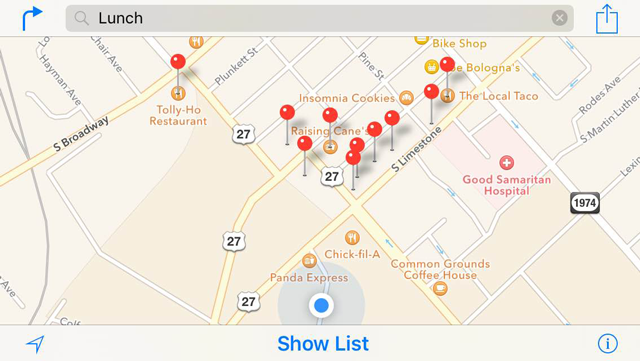
Figure 09. Map Fail (as per Critics) but a Useful Map. Source: a phone.
Throughout the (recent) history of mapping, a tension exists between these three different priorities as evidenced by the back-and-forth, ebb-and-flow of debates within Geography, Cartography and Coding communities. In other words, the arguments between cartographers, coders and critics aren't necessarily new and will continue, whether or not we acknowledge and integrate them into our practices and workflows. Our hope (and ongoing effort) is to develop ways these tensions might be amelioratedOr explode into noisy but incredibly useful creativity. We're OK with either., and bring the tenets of cartography, web coding and social critique together in a style of mapping that doesn't unquestioningly yield power to technology and technical decision-making, or sacrifice the making of maps to a never-ceasing vicious cycle of critical paralysis.
Becoming the New Jerusalems
This also leads to new kinds of questions with which maps and mappers should engage. Rather than simply asking, "Where should we go out to eat?", we need to ask, "What are the conditions under which we seek out a place to eat?" and, "How do those conditions shape how we know, act and intervene in the world?". Don't get us wrong, we like lunch and eating, and hence regularly use maps to find restaurants. But we also worry about how the priorities of maps—what is listed, how is it categorized, how is ranked, what language is used—are making certain things more visible under certain conditions.
Let's conduct an experiment using the old Jerusalem and the new Jerusalem. Fire up Google Maps and search for "restaurant" (Figure 10.a.), "مطعم" (Figure 10.b.) and "מסעדה"(Figure 10.c.) the term for restaurant in English, Arabic and Hebrew in the actual city of Jerusalem. Or if you are feeling lazy, just look at the results below. This simple exercise shows that the possibilities for lunch in the old Jerusalem are fundamentally shaped by the new Jerusalem. Depending upon your language preferences you will be presented with completely different representations of the world. In short, the conditions (in this case language) in which we seek out a place to eat in turn shape what we might think is possible and subsequently how we act during the noon hour. And that's a whole lotta falafel.
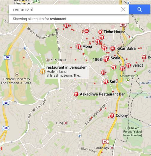
Figure 10.a. Source: Google Maps.
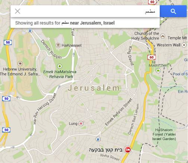
Figure 10.b. Source: Google Maps.
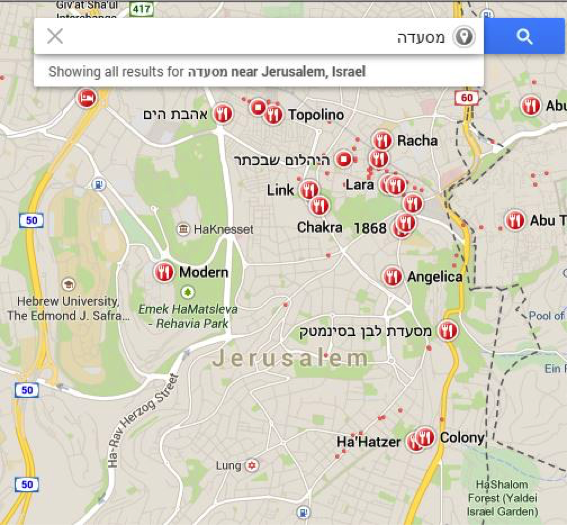
Figure 10.c. Source: Google Maps.
While the case of lunch may seem trivial, it is symptomatic of larger entanglements between maps, data, code, people and places in which we can be active participants. This isn't just the result of the inexorable march of #innovation. These maps are results not only of particular people, places and social structures that went into generating them (in much the same way as this essay is the result of particular people and places and social arrangements), but also of people, places and social structures from the past which have shaped the potentials for future (i.e., present) action.
Our Sheepish Manifesto
So it's important that we understand from whence mapping has come, and how the lessons of the past can give us a new lens through which to view our present efforts at mapping. What have been some of the priorities of mapping? How might these priorities be critiqued? And what how can we use these critiques to map with a certain sensibility? In that spirit, we offer the Floating Sheep Manifesto, a set of ideas that we use in our mapping of the world, both online and offline.
Each of the points of this manifesto is presented—in true academic fashion—as a dialectic tensionJust trying to establish a little academic street cred by using the term dialectic. Admittedly this is likely a hopeless gesture amidst our breezy, satirical essay. or contradiction between two (seemingly) opposed statements. But when taken together the statements bring us to a more nuanced understanding of the contemporary digital mapping process. The goal is to marry the practical requirements of producing technically advanced and aesthetically pleasing maps with a concern for the ways that maps are embedded in, and help to create, broader social structures of power.
#1a. Maps help us to understand the world.
#1b. But maps also produce the world as we know it.
One of the key ideas of mid-twentieth century scientific cartography was the notion that maps served to communicate knowledge from the cartographer to the map reader (cf. Robinson, 1952). By eliminating extraneous information, or "noise," the map could more clearly transmit such knowledge.
But such a straightforward reading of maps is also problematic. Maps are not a simple, objective, value-free window onto the already existing world. By emphasizing a particular aspect of the world—borders, names, or hierarchies—maps also produce the world. Maps are productive, in that they shape the ways we understand the world, bringing the world into being as an object, which we can know and interact with. Or, to paraphrase Jean Baudrillard, "the map precedes the territory". In short, maps do not simply reflect the world. They also change it.
#2a. All maps lie.
#2b. But lies are the source of maps' power.
Following from point #1 of our manifesto, it is also important to remember a basic maxim when discussing maps: all maps lie. The process of taking the three-dimensional earth and representing it in two-dimensions (formally referred to as projection) necessarily involves some measure of simplification and distortion of the 'true' nature of the earth's surface. You may have seen that one clip from a 2001 episode of the West Wing on YouTube.See "Somebody's Going to Emergency, Somebody's Going to Jail". Yeah, you know the one ... where an intrepid band of cartographers are trying to convince White House staff to change the projection used for maps of the world, and CJ asks incredulously, "Are you saying the map is wrong?"
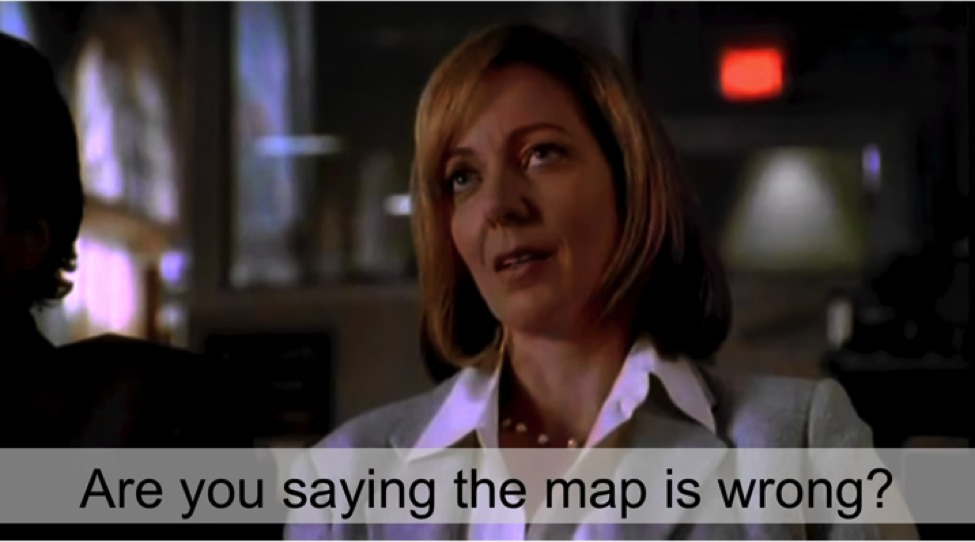
Figure 11. Source: YouTube Screenshot.
A map projection is but one way maps can be "wrong."It's important to note that just because a map "lies" doesn't mean that it's "wrong." But rather than there are always other "truths" which are hidden by the map. Likewise, the representation of any social or natural phenomenon in the form of a map shapes our understandings of that phenomenon. Only so much can be represented on a map at a given time, thus necessarily stripping the map of the richness of context that should otherwise be informing our understanding of the world around us. These lies are not, as Mark Monmonier suggests in his book How to Lie With Maps, simple design decisions that can be overcome through greater attention to the cartographic process, even though such efforts can go a long way. Instead, as J.B. Harley suggested, the form that maps take are always the result of power-laden relationships embodied in the cartographer and the cartographic process, which cannot be minimized by simply using something other than the Mercator projection.Which, by the way, is really bad. Do you know who likes the Mercator projection? Cows. That's who. So don't use that, unless of course you have to, like you do when you use most web mapping applications.
All of this matters because once these decisions and half-truths inherent to the cartographic process are codified in a map, they can become extremely powerful. The reason the 'all maps lie' maxim is so important is because it directly contradicts our commonly held beliefs about the map as a neutral, scientific representation of the world. But as those cartographers for social justice on the West Wing point out, the Mercator projection has wildly distorted people's understanding of the world, equating the size of Greenland and Africa, despite Greenland being about 7.1% the size of the African continent. And, as you know, size matters.
#3a. Maps are now fundamentally different.
#3b. But maps are still fundamentally the same.
With the release of Google Earth in 2005, there was a sense that the practices of mapping had fundamentally changed. Not only were web-based, interactive maps the new default, but making the tools free and easy to use was seen to democratize the world of mapmaking in a way never seen before. Moreover, these changes were thought to allow for new voices to be simultaneously present, overcoming the notion that the map can only represent so much information at once. Instead, competing voices and representations of place could be provided side-by-side, allowing the user to make their own decisions about what information was most accurate or relevant, rather these decisions left up to the more-or-less arbitrary whims of the cartographer. And in some ways mapping has opened up.
But, despite these reconfigurations in the mapping process, a map is still fundamentally a map, a representation of the world, an intervention into it. Maps are still largely seen to be more-or-less accurate and objective. Recent technical advances allowing for the simultaneous representation of multiple, competing understandings of the world may have made maps more representative of reality. But maps are still incredibly partial and incomplete representations of the world, the result of particular configurations of power. And in that sense, a map is still a map, whether it was made with pen and ink or a few lines of code.
#4a. Pretty maps are better than ugly maps.
#4b. But ugly maps will do in a pinch.
Making maps with appropriate color schemes and nice fonts (i.e., not using default software settings) can go a long way in helping to communicate the message of your map more clearly. But this manifesto also recognizes that maps are powerful and there's nothing that says a map has to be pretty to communicate clearly, or expose a previously unknown understanding of a given social phenomena, especially if an issue is time-sensitive and you don't have time to fine tune the nuances of a map or learn advanced design skills.
Certainly a greater attention to design can help your map -- and an absolute refusal to abide by any of the accepted standards of cartographic practice can definitely hurt your map. But suffice it to say that we agree with Eazy-E when he says "F--- Tha (Map) Police!"Ok, we added the word "map". And we didn't really make this either. We blatantly stole it without permission from coder/cartographer Andy Woodruff's 2013 NACIS presentation. But we think he'll probably be cool with that, or maybe not. In which case, we'll claim fair use. After all, it's not like Andy has money to sue us. Sometimes you just have to make an ugly map.Of course, every time someone makes an ugly map, a lolcat dies. Not that we're upset about that. Well, some of us are.
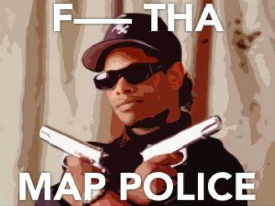
Figure 12. Some dude who works for Axis Maps.
#5a. Map or be mapped.
#5b. But not everything can (or should) be mapped.
In many ways, the ideas and techniques we're discussing in this essay are a result of the development of more participatory approaches to mapping in the late 1990s. While maps have long been used to exercise control over populations—whether in the case of colonial land surveys or the redlining of African-American communities in US cities—these new participatory techniques recognized that it's a "map or be mapped" kind of world. In other words, maps could just as well serve the purposes of the powerless as the powerful. And thus, community maps were made. And so were arguments. Consciousness were raised. Resources and territories were re-constituted through the production of maps.
But despite the attempt to embed the voices of the marginalized in the map, there remain questions about the benefits of the "map or be mapped" approach. Are more marginalized communities being empowered by these mapping efforts? Or are they just serving as a new form of tacitly-accepted (geo)surveillance of marginalized communities? The recent controversy around the Bowman Expeditions in Oaxaca, Mexico is informative. In this instance indigenous communities were enrolled in a participatory mapping project, purportedly to help them lay formal claim to the territories they have controlled informally for a long time. Unbeknownst to them the data generated by the project was to be owned not by the community as a collectively-held resource, but by the United States Department of Defense, who funded the research, as a source of geopolitical intelligence which could help to extend their—and the Mexican central government's—control over such "unruly" places. Thus, a mapping process that was sold as empowering, ultimately reinforced existing power structures, much to the dismay of its participants. With mapping squarely at the center of power struggles, perhaps it's better that not everything be mapped. While such questions will largely be beyond the scope of this essay, it's important to recognize that we should worry about knowing when NOT to map, in addition to knowing how to map more effectively.
#6a. Maps of the digital world are a reflection of the material world.
#6b. But this reflection is imperfect and distorted.
Because data collected from the Internet increasingly contains geographic coordinates, it is relatively straightforward to show how digital data collected from social media platforms is reflecting the patterns, practices, and processes of the offline and material. It's no surprise that there are more digital references to bars than grocery stores in the upper Midwest of the US, where a cold-weather communal drinking culture is prevalent, or that there's a significant overlap in the places where people tweet about 'grits' and use the contracted second-person plural pronoun 'y'all'. These are place-specific cultural practices that are clearly reflected in people's use of the Internet and various social media platforms. In other words, through this kind of data we can see that there isn't some clear inherent separation of people's everyday practices in digital space and their practices in material space. The two are fundamentally interconnected, in ways more serious and substantive than what kind of food or drink one tweets about.
But these reflections (like any reflections) are imperfect. They are distorted by the conditions that allow for such representations, as well as the biases of those who create them. In this case, something like linguistic differences across space affect our ability to represent interest in a given subject, since even the most widely used languages are geographically specific. Similarly, uneven access to the Internet and these kinds of social media platforms—whether due to underdevelopment or government censorship—negatively affects the ability of some people in some places to produce these kinds of representations, leaving countries like China and North Korea as a 'blank spot' on the map.
Taken together, these six linked ideas of the Floating Sheep Manifesto guide our thinking about how to map the world, both online and offline. We humbly suggest that you type them out on a separate sheet of paper and carry them with you.You could start making "mapping manifesto tracts" and leaving them on your co-workers' desks. That will certainly make everyone happy. Perhaps sleep with them under you pillow. We're also not opposed to folks getting tattoos of this manifesto.Although that's really, really a bad idea. Still we're liable to buy anyone a beer who shows up with a mapping manifesto tattoo so yes, we're a bit contradictory.
So go ye forth, and make, enjoy and critique maps in all their glorious and complicated contradictions.
Bibliography
- Bertin, Jacques. 1983. Semiology of Graphics: Diagrams, Networks, Maps University of Wisconsin Press.
- Crampton, Jeremy W. 2010. Mapping: A Critical Introduction to Cartography and GIS. Wiley-Blackwell.
- Bunge, Bill and Gwendolyn Warren. 1971. Detroit Geographic Expedition and Institute. Available from: http://freeuniversitynyc.org/files/2012/09/Detroit-Geographical-Expedition-and-Institute-1971.pdf
- Dodge, Martin, and Chris Perkins. 2008. "Reclaiming the map: British geography and ambivalent cartographic practice." Environment and Planning A40(6):1271-1276.
- Goodchild, Michael F. 2007. "Citizens as sensors: the world of volunteered geography." GeoJournal 69(4): 211-221.
- Graham, Mark, Taylor Shelton, and Matthew Zook. 2013. "Mapping Zombies: A Guide for Pre-Apocalptic Analysis and Post-Apocalytpic Survival." In Zombies in the Academy: Living Death in Higher Education. eds. A. Whelan, R. Walker and C. Moore. University of Chicago Press. pp. 147-156.
- Harley, John Brian. "Deconstructing the map." Cartographica 26(2): 1-20.
- Krygier, John, and Denis Wood. 2011. Making maps: a visual guide to map design for GIS. Guilford Press.
- Lozovsky, Natalia. 2011. "Telling a new story of pre-modern geography: Challenges and rewards." Dialogues in Human Geography 1(2): 178-182.
- Monmonier, Mark. 2014. How to lie with maps. University of Chicago Press.
- North American Cartographic Information Society (NACIS). 2014. Atlas of Design. Available from: http://atlasofdesign.org/
- Robinson, Arthur Howard. 1952. The look of maps: an examination of cartographic design. University of Wisconsin Press.
- Turner, Andrew. 2006. Introduction to neogeography. O'Reilly Media.